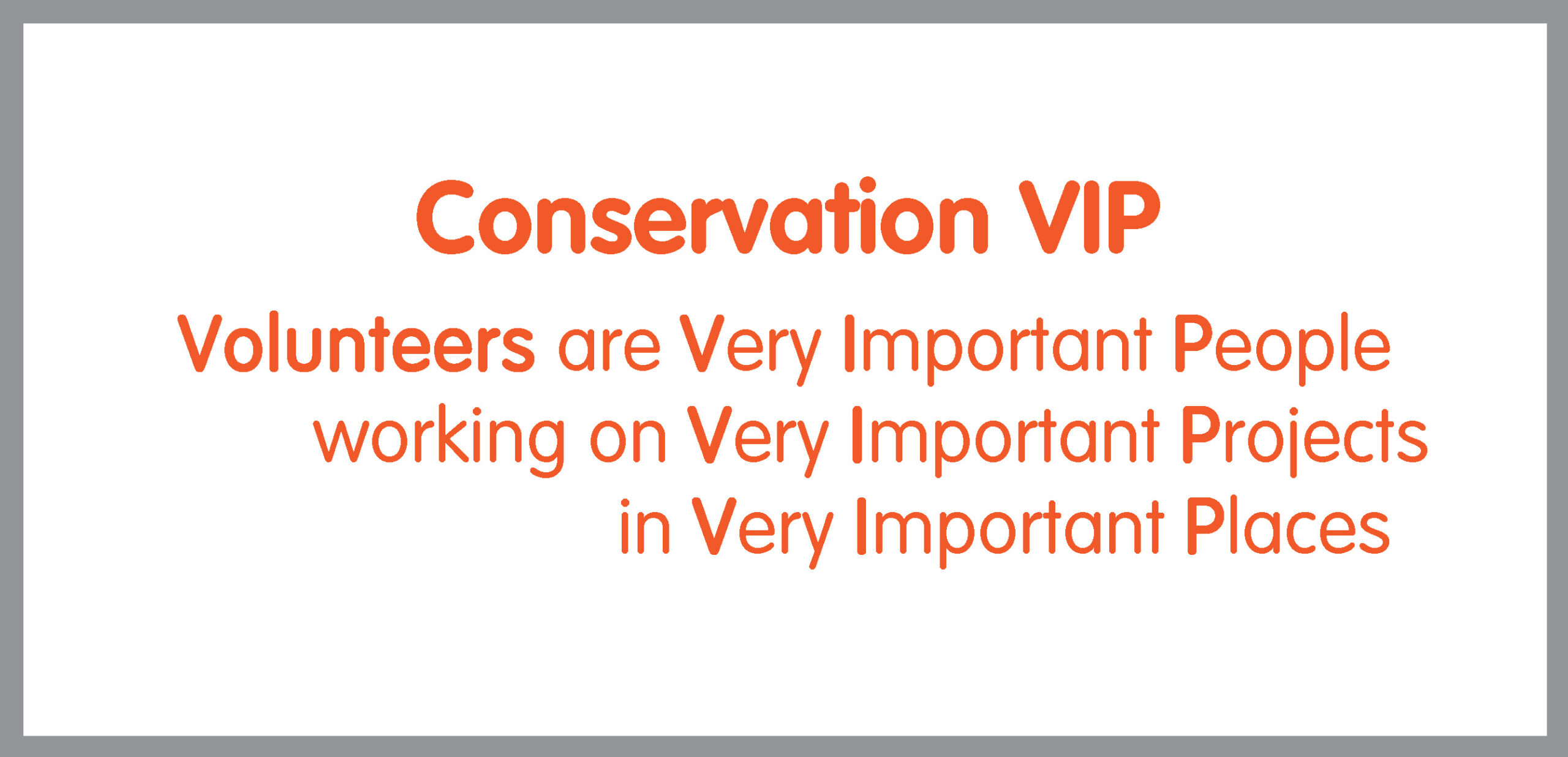
This Is Us
Nope. Not the popular TV show by the same title. Instead, this is about our visual identity. If “a picture is worth a thousand words”, then the branding of an organization should convey the essence of its identity. A meaningful portrayal of a nonprofit will effectively illustrate its mission, vision, and values. While that’s a lot to pack into one symbol, we want to take a few moments and say, “This is us!”
When we first selected an image to identify ourselves visually, we chose an image that contained some key elements of our organization’s mission focus. The sun, mountains, water, and trees which were featured in our original image are all key features of nature’s bounty, which we work to protect as an environmental nonprofit:
![]()
Over time though, we realized that the image looked different depending on the background color and whether the logo was printed on paper, embossed on gear, or digitally reproduced on the web. It also bothered us that the design did not convey our global outlook, which is one our distinguishing features. We volunteer in public lands around the world.
After a few months of back-and-forth work with a graphic artist, we launched our new logo in early 2014. The stationary sun was transformed into a sun/moon moving across international time zones, conveying our care for the entire planet. Our efforts are not just locally concentrated but globally focused, and we care at all times. The mountains and trees highlight our focus on safeguarding and preserving natural resources, while the reservoir at the bottom depicting the river/lake denotes our concentration on the conservation of all things natural and vital for life. The ingress and egress points of the river/lake show respect for the natural flow of nature’s increase and decrease. 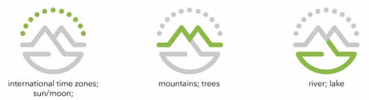
We chose to represent the image in green, which many of us associate with conservation. Green pairs with both the natural tones of land and earth and the lush green landscapes we serve. By varying the placement of the green, we are able to use the logo against different color backgrounds, yet we think it is still recognizable as the same logo.
![]()
Although we know that our accomplishments are extraordinary, we realize it is very hard to get people’s attention. The world is a busy place! So, we selected burnt poppy to represent our name. The color jumps off the page, and we hope the cheerfulness of burnt poppy conveys the way we want our volunteers to feel when they join us on our mission.
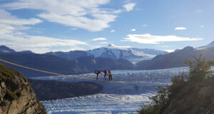
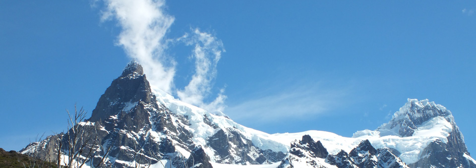
Putting these elements together, we are an organization that is dedicated to helping sustain some of the world’s greatest landscapes, cultural heritage sites, and biodiversity by providing opportunities for people to volunteer in extraordinary places. We invite everyone to travel with purpose, help preserve our national and international treasures, engage local cultures, enjoy spectacular geography, and protect some of the world’s most inspiring destinations.
 |
 |
This is us.